Green Propellant Innovations Reshaping Satellite Propulsion System Market Trends
Other |
2026-06-11 09:58:25
Think back to the last presentation that actually stayed with you. Chances are it wasn't the slide count or the data that made it memorable. It was a feeling a striking opening line, a bold visual, maybe a headline that looked nothing like the default template everyone else uses. Most decks don't get that reaction, and honestly, most decks don't try to earn it. They get assembled in a rush, dumped onto a screen, and forgotten the moment the meeting ends. This guide is about changing that pattern. We'll walk through how to build a solid structural foundation using a generator, then layer in deliberate typography choices that turn a forgettable deck into something people actually pay attention to. Along the way, I'll share a few hard lessons from years of building decks under deadline pressure, including mistakes that taught me more than any tutorial ever did.
Sit through five presentations in a row and you'll notice something strange: they all start to feel like the same presentation. Same white background. Same default sans-serif font. Same three bullet points per slide, repeated until the meeting ends. This sameness isn't an accident it's what happens when nobody questions the starting template. The content underneath might be genuinely valuable, full of smart ideas and useful numbers, yet none of it lands because the visual delivery never breaks the audience's autopilot mode. Once a brain registers "this looks like every other slide," attention quietly drifts elsewhere, often toward a phone. Breaking that pattern doesn't require a complete redesign. Sometimes a single bolder headline, an unexpected layout shift, or one slide that visually contrasts with the rest is enough to snap focus back. I've tested this in real rooms more times than I can count, and the reaction is consistent: people physically look up the moment something visually different appears on screen. Sameness is comfortable for the presenter building the deck at midnight, but it's exhausting for the audience watching it unfold. The goal isn't constant novelty either too much variation creates chaos instead of clarity. The goal is intentional contrast at the right moments, which starts with picking better foundational tools before a single slide gets written.
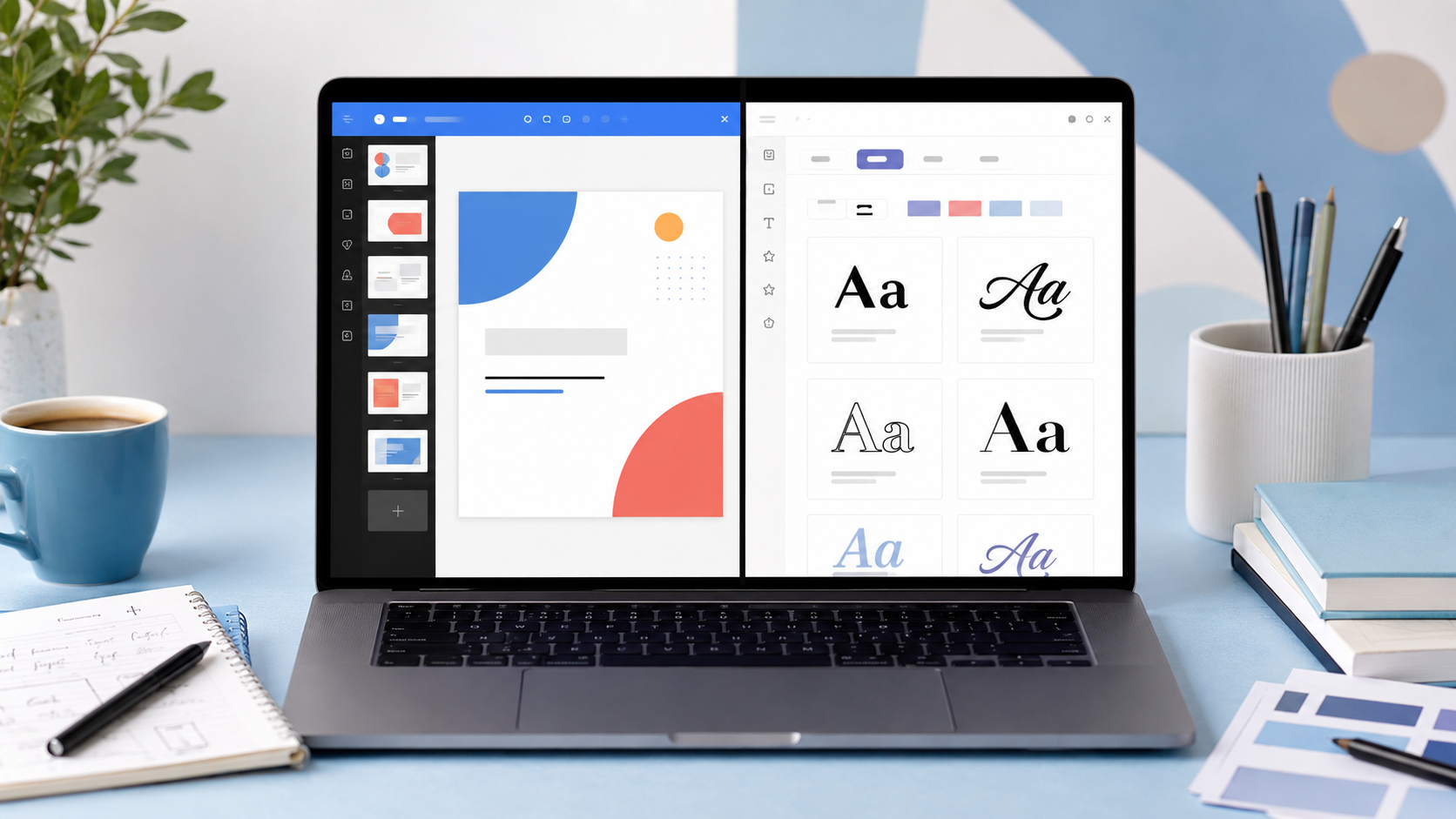
Everything downstream depends on a strong starting structure, so this step deserves real attention rather than a rushed five minutes. Using a slide maker removes the blank-page problem entirely, since most modern tools turn even a vague topic into a logically ordered outline within seconds, complete with section breaks and supporting points. That speed is genuinely useful, but speed alone isn't the deciding factor; flexibility matters just as much, especially around exporting. A tool that locks your finished deck into a flattened image or an uneditable PDF creates more problems later than it solves now. Here's a practical checklist worth running through before committing to any particular generator:
Confirm the export format is genuinely editable, like a real .pptx file, not a static image disguised as one.
Check language support if your audience isn't strictly English-speaking, since multilingual generation saves real translation headaches.
Test slide-count flexibility a tool that only handles ten-slide decks won't help with a forty-minute keynote.
Look for adjustable content depth settings, since an academic conference talk and a casual team update need very different tones.
Generate at least one free sample deck before paying for anything, just to see how the structure actually holds up.
Pay attention to how images get suggested or inserted automatically, since irrelevant stock photography can undercut an otherwise strong deck.
Once the base deck exists, resist the urge to call it finished. Treat the generated version as scaffolding rather than a final product. The logical flow is there, the section order makes sense, but the personality and visual identity still need a human hand. That's exactly where typography enters the process, and it's the part most people skip entirely.
Designers will spend hours debating color palettes and barely think twice about the font carrying their headlines. That's backwards, because typography communicates tone faster than almost anything else on a slide. A heading rendered in a heavy, blocky style reads as confident and direct. The exact same words in a thin, flowing script feel delicate, even romantic. Neither is wrong they're just suited to different rooms. Before picking colors or images, it helps to decide what emotional register your headlines should hit: serious and corporate, playful and casual, technical and precise, or warm and personal. A pitch deck aimed at investors probably needs clean, assertive lettering that signals competence at a glance. A classroom presentation on ancient mythology, on the other hand, might genuinely benefit from something more decorative and story-driven. This is precisely where a font generator earns a permanent spot in the workflow, sitting right next to the slide tool rather than being treated as an afterthought tacked on at the end. It lets you preview dozens of distinct styles in seconds, which beats digging through a slide editor's built-in font menu that usually offers maybe four options, all variations on the same generic sans-serif. I'll admit a personal bias here: I almost always reach for bold or condensed styles on section headers specifically, because they hold up remarkably well even when projected on a dim, low-contrast conference room screen where subtler fonts simply disappear.
Here's where enthusiasm tends to backfire. People discover stylized typography, get genuinely excited, and proceed to stuff every single slide full of it, until the whole deck starts resembling a ransom note pieced together from magazine clippings. Restraint matters far more than variety in this particular case. A reliable rule to follow: pick one or two styled fonts reserved strictly for headlines, and keep all body text plain, simple, and easy to scan. Stylized Unicode text, the kind produced through a schriftgenerator, genuinely shines on titles, section dividers, and quote slides, but it noticeably slows down reading speed the moment it gets applied to full paragraphs of body copy. A handful of practical guidelines tend to keep this in check:
Reserve decorative styles strictly for short phrases, never entire sentences or paragraphs.
Commit to one stylized font family across the whole deck for visual consistency.
Avoid stacking two competing decorative fonts on a single slide; pick one and let it carry the weight.
Always test how the styled text actually renders once pasted into your slide software, since rendering isn't identical across every platform.
Keep contrast high between text color and background, particularly with thinner, more delicate stylized characters.
That last point trips up almost everyone at some stage. A thin script font in pale gray looks perfectly elegant on a laptop screen at close range, then vanishes entirely the second it hits a projector in a sunlit room. Testing under realistic conditions, not just on your own monitor, prevents that embarrassing surprise mid-presentation.
Not every slide deserves decorative lettering, and frankly, most of them shouldn't have any. Title slides, section dividers, and closing "thank you" screens are the natural homes for bold typographic statements. These are pause moments in the presentation's rhythm, where the audience briefly disengages from active listening and simply absorbs a single visual beat, which gives a striking font real room to land without competing against dense information. Mid-presentation data slides need the opposite treatment entirely clarity above absolutely everything else, because nobody wants to squint at elaborate script while trying to follow a live chart explanation. I once sat through a product demo where the presenter applied the same heavily stylized font across every single slide, including the pricing table, and half the room visibly squinted trying to decode the numbers. It was memorable, sure, but for entirely the wrong reason, and the awkward silence afterward said everything. A good source of schriftarten zum kopieren makes it simple to drop a styled title straight onto a slide without fuss, which works particularly well because copy-paste compatibility means you're not wrestling with font installation or licensing restrictions on a borrowed laptop minutes before walking on stage.
Hierarchy is really just a fancier word for "what should someone look at first," and getting it right matters more than almost any other design decision on a slide. Human eyes naturally gravitate toward the biggest, boldest element in view, so that element had better be your headline and not, say, a stray logo sitting awkwardly in the corner. Build each slide in deliberate layers: headline first, supporting visual second, body text trailing last in both size and visual weight. The size and weight relationships between these layers should communicate that order instantly, without requiring conscious thought from the viewer. If every element on a slide shares the same size and weight, audiences have genuinely no idea where to begin reading, and they'll default to skimming randomly, often missing the actual point entirely. A trick that consistently works well: contrast one stylized, heavier headline directly against plain, lighter body copy positioned underneath it this creates an instant visual anchor without needing any additional graphic elements at all. Color reinforces this hierarchy too, certainly, but weight and size genuinely carry most of the load on their own. Nail the hierarchy and even a stripped-down, completely undecorated slide reads clearly within about two seconds, which is roughly the attention window most audience members realistically grant any individual slide before moving on mentally.
Even with excellent tools in hand, certain habits sabotage good presentations without the presenter ever noticing the damage in real time. Overcrowding slides with dense text remains the single biggest offender across nearly every industry when a slide reads like a printed essay, audiences start reading silently instead of listening to the speaker, which defeats the entire point of presenting live rather than just emailing a document. Inconsistent fonts scattered across different slides form another quiet killer, since the deck starts feeling unplanned and improvised even when the underlying content is genuinely strong and well-researched. Then there's the persistent timing problem: rushing through twenty dense slides in five frantic minutes leaves nothing memorable behind, while lingering far too long on a single slide drains all the momentum a presentation had been building. I want to be honest about a real limitation here, since over-promising helps nobody no software tool, however genuinely smart or well-designed, fixes pacing or storytelling instinct for you automatically. Generators handle structure beautifully, and font tools style text gorgeously, but the actual narrative arc, the deliberate pauses, the vocal emphasis at the right moment that responsibility stays entirely with the human standing in front of the room. Treat every tool discussed here as scaffolding supporting your delivery, never as a replacement for genuine rehearsal time.
By this point you've got a clear, repeatable sequence to follow. Start by building the structural skeleton through a generator, then refine the narrative manually wherever it feels generic or templated. Next, commit to one styled font for headlines specifically and apply it consistently across every single slide in the deck, resisting the temptation to swap styles partway through. Finally, walk the entire deck once with genuinely fresh eyes ideally after stepping away for an hour checking contrast levels, spacing consistency, and whether each individual slide earns its place in the sequence or could simply be cut. This whole process realistically adds maybe twenty to thirty extra minutes beyond just clicking "generate" and calling it done, yet the difference becomes obvious the very moment you present the result in front of real people. Audiences consistently remember decks that feel intentional and considered. They just as consistently forget the ones that look like everyone else's default output.
Strong presentations were never really about expensive software or rare design talent they come down to deliberate, stacked choices built on top of a genuinely solid structural foundation. A generator gets the skeleton moving fast, removing the blank-page panic entirely, while thoughtful typography gives the finished result a personality that lingers in someone's memory long after the lights come back up and the room empties out. Start small if this feels overwhelming. Pick one deck you're currently working on this week, swap a single boring headline for something with genuine character and contrast, and notice exactly how much more attention that one slide pulls compared to the rest. That single change is usually all it takes to convince anyone the extra effort is worth repeating going forward.
Q1: Do I need design experience to make a good presentation? Not really. A clear structure paired with consistent typography choices matters far more than formal design training ever does. Start simple, observe what works in real rooms, and adjust gradually from there.
Q2: How many fonts should one presentation realistically use? Two is genuinely plenty one reserved for headlines, one for body text. Adding more almost always makes slides feel cluttered and unplanned rather than creative or intentional.
Q3: Will stylized Unicode text display correctly on every device? Mostly yes, across modern phones, tablets, and computers without any issue. Very old devices or seriously outdated browsers occasionally show plain squares instead of the intended characters, though this is increasingly rare.
Q4: Can I edit a generated presentation after it's already been created? Yes, as long as the original tool exports an editable file format rather than a flattened image or a permanently locked PDF. Always confirm export format before relying heavily on any single platform.
Q5: Should every slide in a deck have a styled headline? No, and that's actually a common overcorrection. Reserve decorative styling specifically for title slides, section breaks, and closing screens. Data-heavy slides genuinely read better with plain, high-contrast text throughout.